Hey there! Yes, I’m talking to you, the blogger who’s wondering why your ads aren’t performing as well as they should. I was exactly where you are about two months ago, watching my blog grow in traffic but seeing disappointingly low ad revenue. Let me share something that completely changed the game for me.
You know what’s crazy? I nearly gave up on ads altogether. My blog was getting decent traffic, about 15,000 monthly visitors, but those ads?
They were basically invisible. Or worse, they were so jarring against my site design that visitors were actively avoiding them.
Then I discovered something so simple yet so effective that I couldn’t believe I hadn’t tried it before: content-blending 😊.
What’s Content-Blending (And Why Your Blog Needs It)
Content-blending is exactly what it sounds like; it’s making your ads blend naturally with your blog’s content. But here’s the thing: I’m not talking about hiding ads or anything sketchy. I’m talking about thoughtful design integration.
Think about it this way: when someone visits your blog, they’re in a specific mindset. They’re reading your content, looking for information, maybe comparing options. Anything that feels like an interruption gets mentally filtered out.
When I realised this, everything changed. Instead of fighting against the ads on my site, I decided to work with them.
The Blue Discovery That Changed Everything
Here’s my big revelation, and it’s almost embarrassingly simple: I started paying attention to the ads that naturally appeared on my blog. I visited in incognito mode, from different devices, at different times of day.
And I noticed something interesting 🤔.
The majority of ads displayed used a particular shade of blue in their headers or buttons, specifically something close to #4d92db. This makes sense; blue conveys trust and professionalism, values that readers across niches appreciate (even Google uses this colour on their search engine).
I thought about my site, not the one you are currently reading this on, obviously 😅. It was all greens and orange (you can tell how much I love the colour orange; even my mentor, Mr Gabriel Okocha, uses this colour for all Trispark brands).
Let’s get back to the topic: I earlier chose these colours because they felt “energetic” and “fresh 🌱. The disconnect was jarring when I think about it now.
So I made a simple change. I adjusted my site’s colour scheme to incorporate that same blue family. Not everywhere, but strategic section headings, button colours, and link text.
The results were immediate and honestly kind of shocking.
Real-Life Example: What I Noticed at My Local Gym
Let me explain this in a way that really helped it click for me. Last month, I was at my local gym, the one I’ve been going to for years now, when something caught my attention.
I was on the treadmill, that sweet spot where you’re warmed up but not yet exhausted, when I noticed something interesting happening around me. The gym had recently been renovated, and I realised they’d made some subtle but powerful changes.
Remember how the premium membership information used to be stuffed in that awkward corner by the entrance? Well, now they had these sleek blue signs positioned right between the treadmill section and the free weights area, literally the path everyone takes during their workout routine.
But here’s what was clever: the blue of those signs (that same #4d92db shade I mentioned earlier) now matched the new blue accent lighting they’d installed along the walkways. Even the towel racks and water stations had been updated with the same blue trim.
I caught myself actually stopping to read one of the premium membership offers, something I’d never done before, and it hit me: “This is exactly what I’ve been talking about with content-blending!“
The gym hadn’t made their membership information more aggressive or intrusive. They simply integrated it into the natural flow of the gym experience and used colour psychology to create a subtle connection. I was attracted to those signs because they felt like they belonged in my workout experience, not because they were shouting at me.
The next week, I chatted with Trevor, the owner, about something completely unrelated. He mentioned offhandedly that premium membership conversions had nearly doubled since the renovation. When I asked if the new positioning of the signs was intentional, he just smiled and said, “People respond to what feels natural.”
That’s when it really crystallised even better for me. Whether it’s a physical space like a gym or your blog’s digital environment, people don’t automatically tune out things that feel like they belong. They tune out interruptions and jarring experiences.
This is why content-blending works so well across any platform. Our brains are wired to accept and engage with elements that feel harmonious with our current experience. When your ads blend naturally with your content, using that consistent blue that appears in so many advertisements, they become part of the reader’s journey rather than an obstacle in their path.
I’ve applied this exact same principle to my blog, and the results speak for themselves. It’s not about tricking anyone; it’s about creating a seamless experience where everything feels like it belongs.
How You Can Do This On Your Own Blog (Step-By-Step)
Want to try this on your own blog? Here’s exactly what I did:
Step 1: Become an Observer
Open your blog in incognito mode (this gives you a more authentic view of what ads actually appear). Take screenshots of several pages where ads appear.
Do this at different times and from different devices if possible. Pretend you’re a first-time visitor and pay attention to where your eyes naturally go.
Step 2: Identify Color Patterns
What colours show up most frequently in the ads? For many blogs, you’ll often see blues and greys dominating, but your audience might see something different. For my blog, that #4d92db blue was everywhere, in ad headers, buttons, and sometimes backgrounds. Make note of the most common elements and colour codes.
Step 3: Analyze Your Current Design
Before making changes, document your current colour scheme. Take screenshots of your blog’s main elements: headers, buttons, links, and icons. This will help you make targeted changes and track the transformation.
Step 4: Make Strategic Color Adjustments
Access your site’s theme settings. You don’t need to completely overhaul your design; just incorporate these common ad colours into your existing scheme:
- Change category headers to match the dominant ad color
- Update call-to-action buttons to use similar shades
- Adjust link colors to complement the ad palette
- Modify icon colors to create visual harmony
Step 5: Test Different Placements
Try moving your ad blocks to different positions that naturally flow with your content. I found that placing ads after high-engagement points (like after the first main image or between related sections) significantly improved performance.
Step 6: Track Your Results
Set up proper tracking before and after making changes. Record your baseline metrics, including:
- Click-through rate (CTR)
- Revenue per mille (RPM)
- Overall engagement metrics
- Bounce rate Compare these numbers weekly after implementing your changes.
Step 7: Refine Based on Data
After two weeks, analyse which changes had the most impact. Double down on what’s working and adjust what isn’t. This is an iterative process; small tweaks can lead to significant improvements over time.
The key is consistency and subtlety. You’re not copying ads; you’re creating a visual environment where they feel like a natural extension of your content. Your readers will appreciate the more cohesive experience, even if they don’t consciously notice the changes you’ve made.
What Actually Happened When I Made These Changes
Let me share some real numbers with you.
Before making these changes, my ad click-through rate was hovering around 8%, pretty dismal. Within two weeks of implementing my colour-matching strategy, that number jumped to 17% and eventually settled around 20%.
That’s more than double the engagement.
But here’s what really surprised me: user feedback actually improved. The site felt more cohesive and professional. Readers mentioned that the platform seemed more “polished” than before.
Visitors stayed longer too; my average session duration increased by about 40 seconds. That might not sound like much, but it’s significant.
Staying On The Right Side Of Ad Policies
Now, I want to be super clear about something. This approach is completely within Google AdSense policies (and other networks too). In fact, they provide colour customisation tools specifically for this purpose, as you can see in the screenshot.
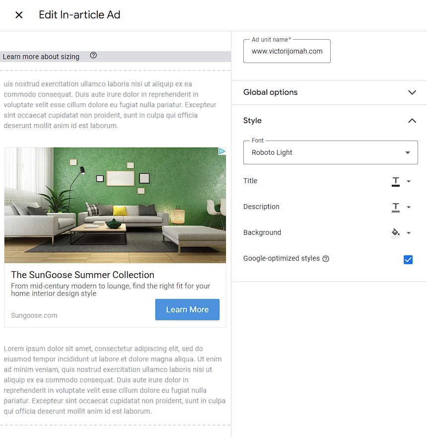
Google AdSense offers a robust set of style customisation options that allow you to legitimately integrate ads with your site’s design. In the interface, you’ll notice options for:
- Font selection (like Roboto Light shown in the example)
- Title formatting
- Description text styling
- Background color adjustments
- Google-optimized styles (which you can enable with a single click)
The key difference between smart content-blending and deceptive practices is intent and proper disclosure. You’re not trying to trick visitors into clicking ads; you’re creating a cohesive visual experience where ads don’t disrupt the user journey.
Always Label Your Ads Appropriately
This is critical: While blending is encouraged, proper disclosure is mandatory. Google requires that all ads maintain clear labelling so users understand they’re viewing promotional content. Never remove or obscure the “Sponsored” or “Advertisement” labels that appear with ads.
The screenshot shows how Google’s interface maintains these distinctions while still allowing for customisation. Notice how the sample ad clearly presents itself as an advertisement for “The SunGoose Summer Collection” with distinct borders and a “Learn More” button, even while allowing for style customisations.

Need Personalized Ad Optimization Help?
Get expert guidance to maximize your ad revenue
After helping dozens of bloggers increase their ad revenue using the content-blend method, I’m offering limited one-on-one counseling sessions to help you apply these techniques to your specific blog.
What You’ll Get:
- Personalized color analysis of ads appearing on YOUR blog
- Custom theme adjustment recommendations tailored to your niche
- Optimal ad placement strategy for your specific content layout
- 60-minute video consultation with screen sharing
- 2 weeks of follow-up email support
— Emmanuel., Scholarship Blogger
Limited Time Offer: $39 per session
(Regular price: $100)
Only 5 spots available this month
FAQs on Ads Content-Blending
What exactly is content-blend advertising?
Will content-blending work for any type of blog?
Does content-blending violate Google AdSense policies?
How long before I see results from content-blending?
What metrics should I monitor to measure content-blending success?
Will changing my blog’s colours affect my brand identity?
Can I use content-blending with affiliate marketing links?
Is blue (#4d92db) always the best colour for content-blending?
What You Should Do Today
If you take nothing else from my experience, try this one simple action: spend 20 minutes observing the ads that appear on your blog. Note the colours, styles, and formats that appear most frequently.
Then make just one adjustment to your site’s theme to better align with these patterns. Maybe it’s changing your button colours or adjusting your section headers.
Track the results for two weeks and see what happens. I’m betting you’ll see improvement.
I’d love to hear how this works for you! Drop me a comment below with your before-and-after experiences, or any questions you have about implementing this on your specific blog.
Remember, the most effective advertising doesn’t feel like advertising at all, it feels like a natural extension of the value you’re already providing to your readers.
May the Force be with you 💪.
Disclosure: My content is reader-supported. If you click certain links, I may earn a commission at no extra cost to you. Your support helps keep my blog running. Learn more about my funding and editorial process.